
How to Decorate A Mantel
September 4, 2025
When it comes to decorating your mantel, have fun with it! Try layering items of various heights and textures for a lively look. Mix in both functional and decorative pieces, and don’t forget to choose elements that match your personal style and the vibe of the room. Happy decorating!
1. Begin with a Base:
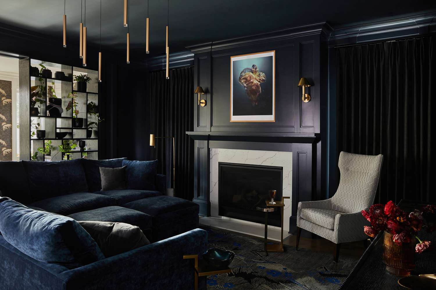
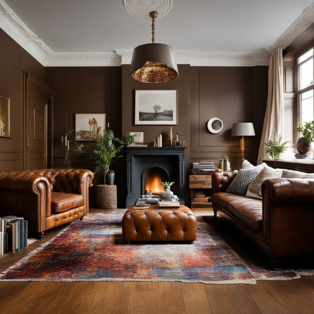
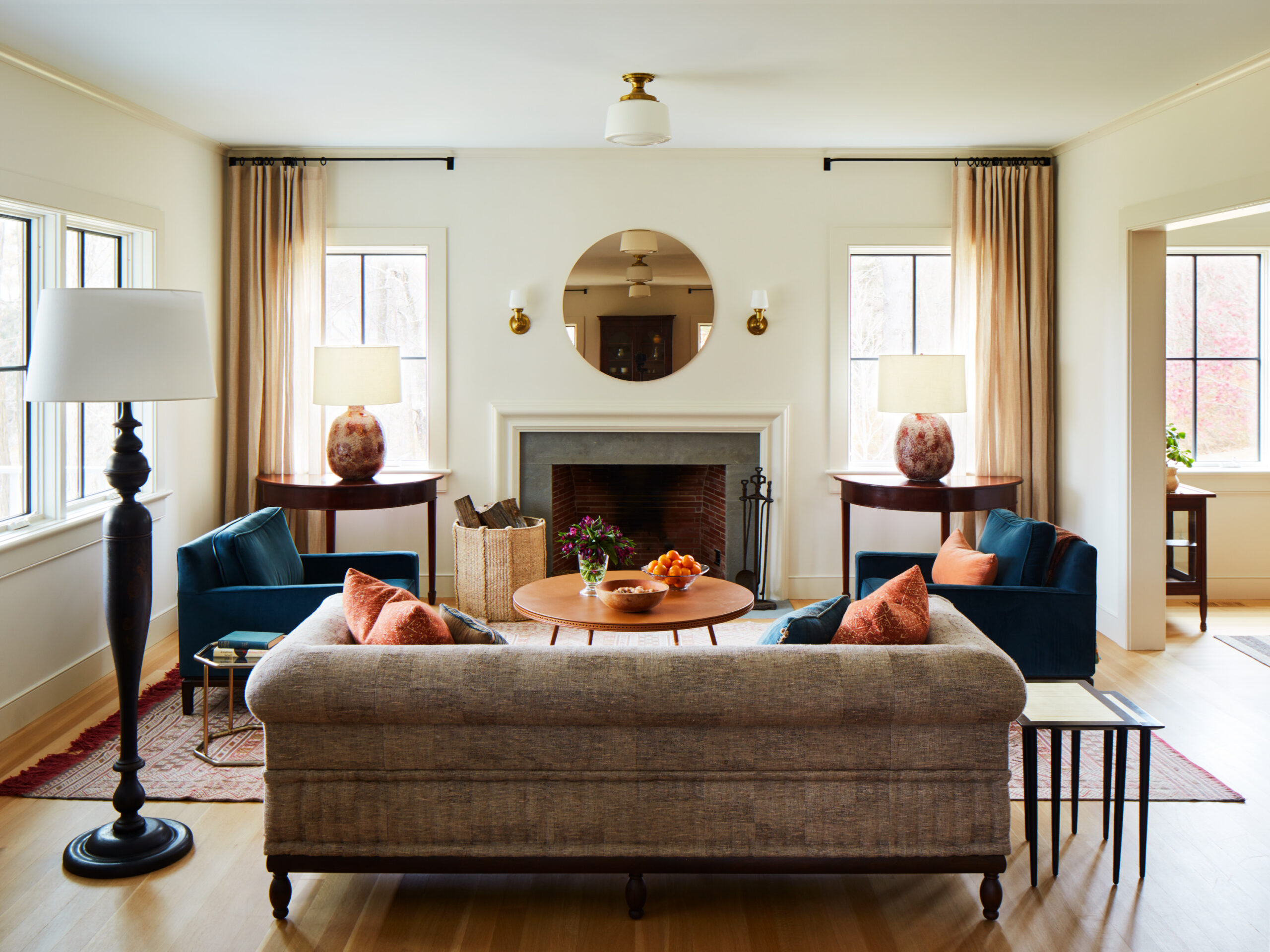
- Mirrors: A large mirror placed in the center can work wonders! It adds depth and reflects light, making your space feel more open and inviting.
- Artwork: Consider hanging some artwork or leaning it against the mantel for a lovely touch, whether you’re going for a classic or casual vibe.
- Statement Piece: Anchor your display with an oversized decorative item, like a trendy sculpture or a unique vase, to make it stand out.
2. Layer and Build:
- Mix Heights and Textures: Play around with various heights! Tall candlesticks, stacks of books, and smaller decorative items can create fun visual interest. –
- Collections: If you have a collection of similar items, like vases or framed photos, showcase them together for a cohesive and stylish look.
- Layering: Don’t be afraid to overlap and layer your pieces! This will draw the eye in and add wonderful depth.
3. Add Functionality:
- Candles: Lighting some candles can add warmth and a cozy ambiance, especially on chilly evenings when the fire is crackling!
- Books: Stack some books on your mantel or include them in your display to introduce texture and a touch of sophistication.
- Vases: Vases aren’t just for flowers! Use them to hold greenery or other decorative items to brighten up your space.
4. Incorporate Personal Touches:
- Family Photos: Frame and display your favorite family photos to add a personal touch and make the space feel warm and inviting.
- Decorative Objects: Bring in decorative objects or figurines that reflect your personality and style—they add character!
- Seasonal Decor: Have fun switching your mantel décor with seasonal items like garlands, pumpkins in the fall, or festive Christmas decorations.
5. Tips for a Cohesive Look:
- Color Scheme: Choose colors that complement your room’s decor for a harmonious look.
- Balance: Mix your larger and smaller items to create a balanced display that feels just right.
- Keep it Simple: Remember, less is often more! A curated display will have more impact than a cluttered one.
- Consider the Size: Make sure your decorations match the size of your mantel; the correct scale can make all the difference! Embrace your creativity, and enjoy decorating your mantel!